

User guide
Everything PrismFX does, step by step.
From installing the plugin to password-protected client galleries. Every screen and every setting, explained with real screenshots.



Contents
Jump to a chapter.
- 1Install PrismFXFree plugin, Pro and your licence key.
- 2Your first galleryFrom photos to a published gallery in five minutes.
- 3Add and edit photosBatch upload, the quick-edit table and bulk changes.
- 4Choose a layoutAll 30 layouts, and a different one for phones.
- 5Gallery settingsLook, grid, motion: every option explained.
- 6More settingsSize, cards, colours and Expanding Panels.
- 7Add a gallery to a pageBlock, shortcode and page builders.
- 8Filters, viewer and sharingWhat your visitors can do.
- 9WatermarksPut your name on every photo.
- 10Pro featuresAlbums, video, passwords and image protection.
- 11Import from 3D Photo CarouselsMove old carousels across in one click.
- 12TroubleshootingQuick answers when something looks off.
Chapter 1
Install PrismFX.
PrismFX Portfolio is free. PrismFX Pro is an add-on that runs alongside it. Both need WordPress 6.0 or newer and PHP 7.4 or newer.
Install the free plugin
- Download
prismfx-portfolio.zipfrom the free download page. Keep the file zipped. - In your WordPress dashboard go to Plugins → Add New → Upload Plugin.
- Choose the zip, click Install Now, then Activate.
A new PrismFX menu appears in the dashboard sidebar. Everything in this guide starts there.
Add PrismFX ProPro
- Keep the free plugin installed and active. Pro adds to it.
- Download
prismfx-portfolio-pro.zipfrom your purchase email or the My licence page. - Upload it under Plugins → Add New → Upload Plugin and click Activate.
Pro adds its layouts and features to the same screens. There is nothing to migrate, and every gallery you already made keeps working.
Activate your licencePro
- Go to PrismFX → Pro licence.
- Paste the key from your purchase email (it starts with
PFX-). - Click Activate licence.
The screen then shows how long updates are included, or Active. Updates included for life. for a lifetime licence. While the licence is active, Pro updates arrive in Dashboard → Updates like any other plugin.
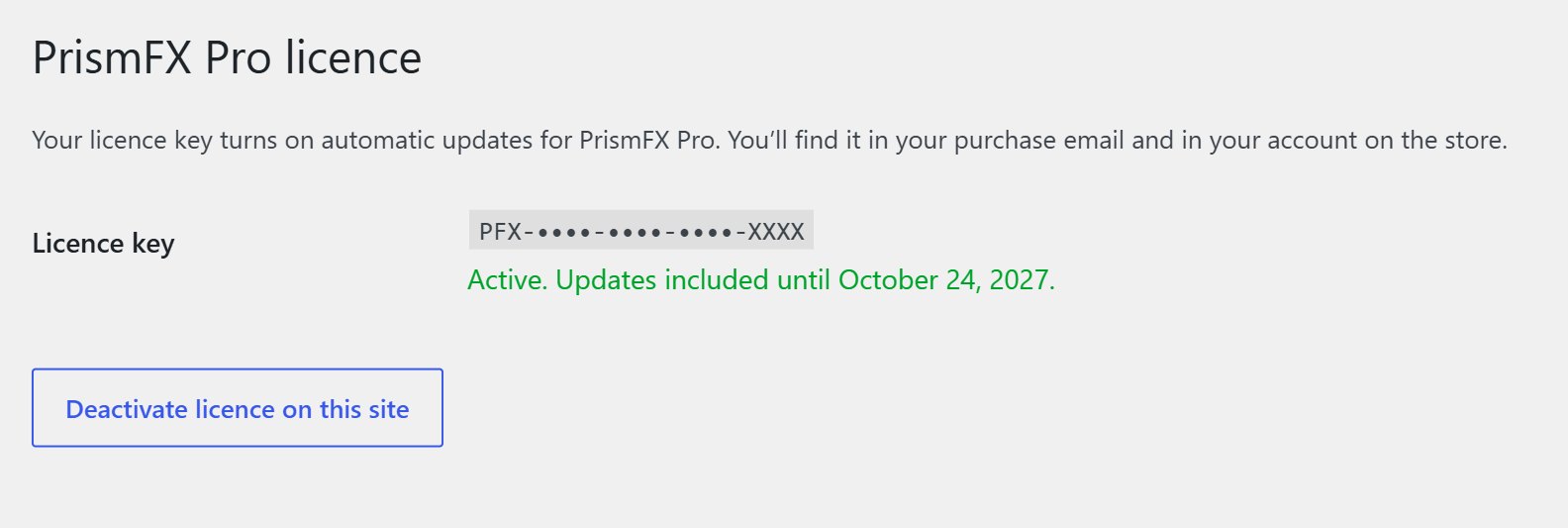
The Pro licence screen once a key is active. To move a licence to another site, click Deactivate licence on this site first.
Chapter 2
Your first gallery in five minutes.
The whole job happens on one screen. Here is the short version; the next chapters go into each part.
- Go to PrismFX → New gallery and type a name, for example Weddings 2026. Only you see the name.
- Drag a batch of photos onto the Photos box, or click Add photos to pick them from your Media Library.
- Fill in titles, categories and buttons in the table. Titles are already filled in from your file names.
- In Gallery settings on the right, click a layout.
- Click Publish, then add the gallery to any page with the PrismFX Gallery block or the shortcode in the Add to a page box.
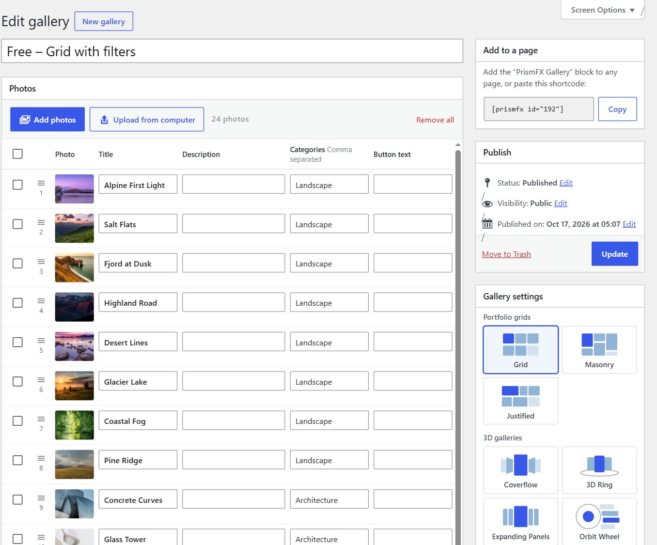
The gallery screen. Click any screenshot in this guide to open it full size.
- 1Gallery name at the top, for your own reference.
- 2Photos: the quick-edit table, one row per photo.
- 3Add to a page: the shortcode, with a Copy button.
- 4Publish: saves the gallery. Use Update after changes.
- 5Gallery settings: layout, look and everything else.
- ↓Preview, further down: the saved gallery as visitors see it.
All your galleries in one list
PrismFX → All galleries lists every gallery with a thumbnail, its layout, how many photos it has and its shortcode. Click a name to edit it.
A gallery is only shown on your site where you place it, so you can build and preview one before it goes on any page.
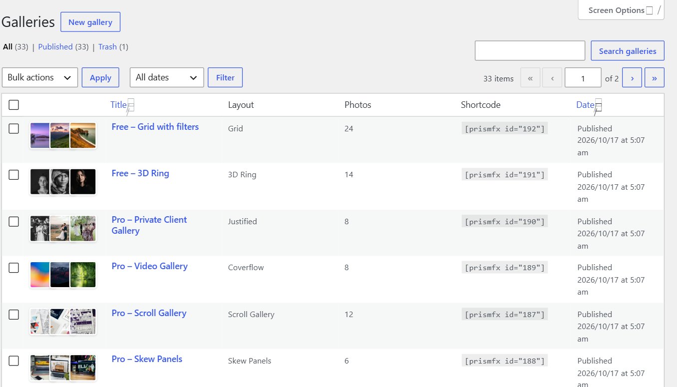
PrismFX → All galleries.
Chapter 3
Add and edit photos.
Every photo is one row in a table, so a whole shoot can be titled, tagged and linked in a few minutes.
Add photos
- Add photos opens your Media Library. Select as many as you like (hold Ctrl or ⌘, or Shift for a range) and click Add to gallery.
- Upload from computer, or drag files straight onto the Photos box. A whole folder at once is fine; the box shows Uploading 3 of 20… as it goes.
Uploaded photos are also saved in your Media Library, so you can reuse them in other galleries.
Smart titles
Titles fill in from the file name: IMG_2034-desert-dunes.jpg becomes Desert Dunes. If a photo already has a caption in the Media Library, it becomes the description.
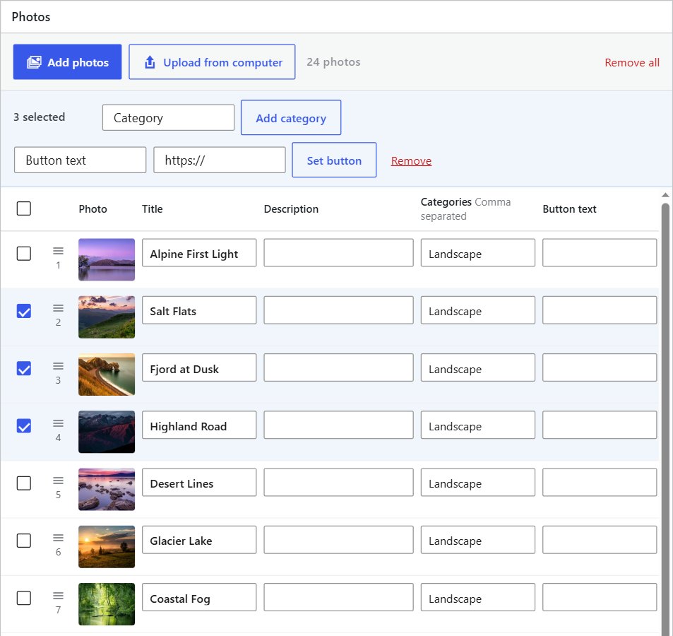
The Photos table with three rows ticked. The bar above the table applies a change to all of them at once.
What each column does
| Column | What it does |
|---|---|
| Title | Shown in the caption and the full-screen viewer. |
| Description | A line or two under the title. You can hide descriptions in More settings. |
| Categories | Type one or more, separated by commas: Weddings, Portraits. Categories create the filter buttons above the gallery. |
| Button text | The label of the photo’s button, for example View case study. Leave it empty to use the default text (Learn more). |
| Button link | Where the button goes. A button only appears when a photo has a link. |
| New tab | Tick it to open the link in a new browser tab. |
| Video linkPro | A YouTube, Vimeo or .mp4 address. See Pro features. |
Work faster
- Press Enter in a box to jump to the same box on the next photo. Great for typing a column of titles.
- Drag the handle ≡ next to a photo to change the order.
- Replace swaps the picture but keeps its title, description and button.
- × removes one photo from the gallery. Remove all empties it.
- Tick several rows (or the box at the top for all of them) and use the bar that appears: Add category, Set button or Remove.
Click Publish (or Update) to save. Every page that shows the gallery updates at once.
Chapter 4
Choose a layout.
Click a tile in Gallery settings to switch layout. Your photos and text stay the same, so you can try as many as you like.
Pick a layout
The picker is grouped into Portfolio grids, 3D galleries and FX layouts. A short description of the selected layout appears under the tiles.
The settings below the picker change with the layout: column settings appear for grids, speed settings for moving layouts, and so on. Anything a layout doesn’t use is hidden.
A different layout on phones
On phones, use switches screens narrower than 640px to another layout. A popular pairing is a 3D Ring on desktop and a simple Grid or Coverflow on phones. Leave it on The same layout to keep one layout everywhere.
Without Pro the picker shows the six free layouts. If Pro is switched off later, galleries that use a Pro layout show as a Grid until it is back on. Their settings are kept.
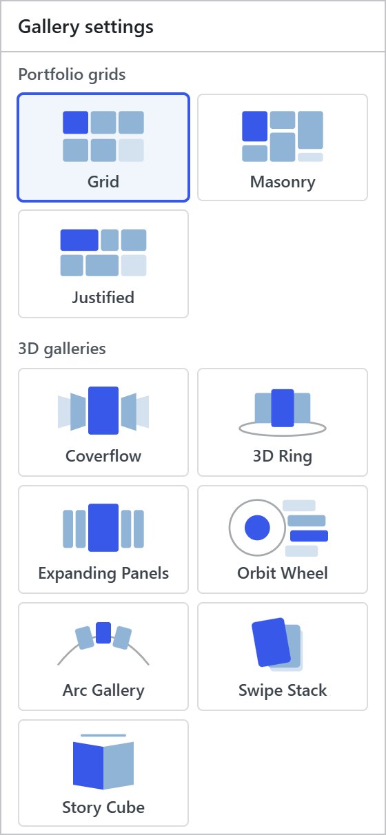
The layout picker. Pro adds four more 3D galleries and the 20 FX layouts below them.
All 30 layouts
The Shortcode name is what you type to choose a layout for one page only (see chapter 7).
| Layout | Type | What it looks like | Shortcode name | |
|---|---|---|---|---|
| Grid | Portfolio grid | Even rows in the photo shape you choose. The classic portfolio. | grid | Free |
| Masonry | Portfolio grid | Columns that keep every photo’s own shape, packed like a pinboard. | masonry | Free |
| Justified | Portfolio grid | Equal-height rows that fill the width with no cropping. | justified | Free |
| Coverflow | 3D gallery | One big photo in the middle, neighbours angled away. Great on phones. | coverflow | Free |
| 3D Ring | 3D gallery | Matted prints in a rotating ring with a soft floor reflection. | ring | Free |
| Expanding Panels | 3D gallery | Tall photo strips. The chosen one widens and tilts forward. | panels | Free |
| Orbit Wheel | 3D gallery | Cards orbit a round hub that shows the chosen photo. | orbit | Pro |
| Arc Gallery | 3D gallery | Cards glide endlessly along a curved arc. | arc | Pro |
| Swipe Stack | 3D gallery | A deck of cards; swipe or tap the top one away. Made for phones. | stack | Pro |
| Story Cube | 3D gallery | Full-width slides that turn like a cube, with story-style progress bars. | cube | Pro |
| Helix | FX layout | Photos spiral around a vertical axis. | helix | Pro |
| Tunnel | FX layout | Photos rush toward you out of a deep tunnel. | tunnel | Pro |
| Flip Book | FX layout | An open book; each photo turns like a page. | flipbook | Pro |
| Slot Reel | FX layout | A vertical drum that rolls photos into view. | reel | Pro |
| Wave | FX layout | A row of photos riding a gentle 3D wave. | wave | Pro |
| Card Fan | FX layout | Photos fanned like a hand of cards; the chosen one lifts. | fan | Pro |
| Time Machine | FX layout | Photos stack back into the distance; step forward through them. | timemachine | Pro |
| Sphere | FX layout | A globe of photos you can spin in any direction. | sphere | Pro |
| Polaroid Table | FX layout | Instant prints scattered on a table; the chosen one is picked up. | polaroid | Pro |
| Perspective Wall | FX layout | A wall of photos sliding past at an angle. | wall | Pro |
| Blinds | FX layout | A full-width slideshow that turns in strips. | blinds | Pro |
| Tile Flip | FX layout | A full-width slideshow that flips tile by tile. | tiles | Pro |
| Cinema | FX layout | A widescreen slideshow with slow camera moves. | cinema | Pro |
| Liquid | FX layout | Photos ripple and melt into each other. | liquid | Pro |
| Tilt Grid | FX layout | A grid where each photo tilts toward the pointer. | tilt | Pro |
| Spotlight Grid | FX layout | A darkened grid; a soft spotlight follows the pointer. | spotlight | Pro |
| Infinite Marquee | FX layout | Rows of photos stream past on a tilted plane. Great as a hero. | marquee | Pro |
| Scroll Gallery | FX layout | Scrolling the page slides the photos sideways, with depth. | scrollx | Pro |
| Stacking Cards | FX layout | Large photos stack on top of each other as the page scrolls. | stackscroll | Pro |
| Skew Panels | FX layout | Slanted photo strips; the one you point at widens. | skew | Pro |
Chapter 5
Gallery settings.
The essentials sit at the top of the Gallery settings box. Each one is saved with the gallery, so every gallery can look different.
Look
| Setting | Options | Default |
|---|---|---|
| Card colour | Light or Dark frames around the photos. | Light |
| Captions | Always show, Show on hover, or Hide. | Always show |
| Clicking a photo | Opens it full screen, Follows its button link, or Does nothing. | Opens it full screen |
| Show category filter | Filter buttons above the gallery. They only appear when photos have categories. | On |
Grid
Shown for Grid, Masonry and Justified, and the Pro grids.
| Setting | Range | Default |
|---|---|---|
| Columns on desktop | 1 to 8 | 3 |
| Columns on tablets | 1 to 6 | 2 |
| Columns on phones | 1 to 4 | 1 |
| Photo shape | Square, Landscape 4:3, Landscape 3:2, Wide 16:9, Portrait 3:4 or Original shape. Grid layouts only. | Landscape 4:3 |
| Row height | 100 to 600px. Justified only. | 260px |
| Space between photos | 0 to 60px | 16px |
Motion
Shown for 3D and FX layouts.
| Setting | Range | Default |
|---|---|---|
| Play automatically | Moves on by itself and pauses while the pointer is over the gallery. | On |
| Seconds per photo | 1 to 15 seconds | 3.5 |
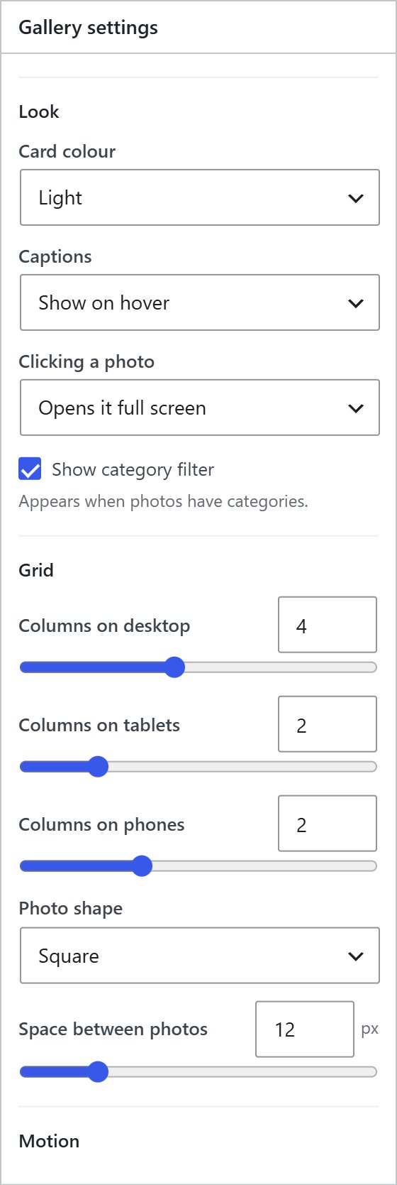
The Look and Grid settings.
Chapter 6
More settings.
Click More settings at the bottom of the Gallery settings box for exact sizes, card details, colours and protection. The defaults work well, so only change what you need.
Size
| Setting | What it does | Default |
|---|---|---|
| Width | How wide the gallery is, 10 to 100%. | 100% |
| Width on phones | The same, for phones. | 100% |
| Width is a percent of | The content area, or The whole screen. Choose the whole screen to break out of a narrow theme column. | Content area |
| Alignment | Left, Center or Right, when the width is under 100%. | Center |
| Max width | A hard limit in pixels. Leave empty for none. | None |
| Height | How tall moving layouts are, 160 to 1000px. | 420px |
| Height on phones | The same, for phones. | 340px |
Cards and captions
| Setting | What it does | Default |
|---|---|---|
| Card size | Automatic, or Exact size to set a card width and height in pixels. | Automatic |
| Card scale | With automatic sizing: make cards bigger or smaller, 140 to 480. | 260 |
| Corner rounding | 0 for square corners, up to 40px. | 10px |
| Show descriptions in captions | Turn off to show titles only. | On |
| Show arrows and position | The ‹ › arrows and the “3 of 12” counter on moving layouts. | On |
| Default button text | Used when a photo has a link but no button text. | Learn more |
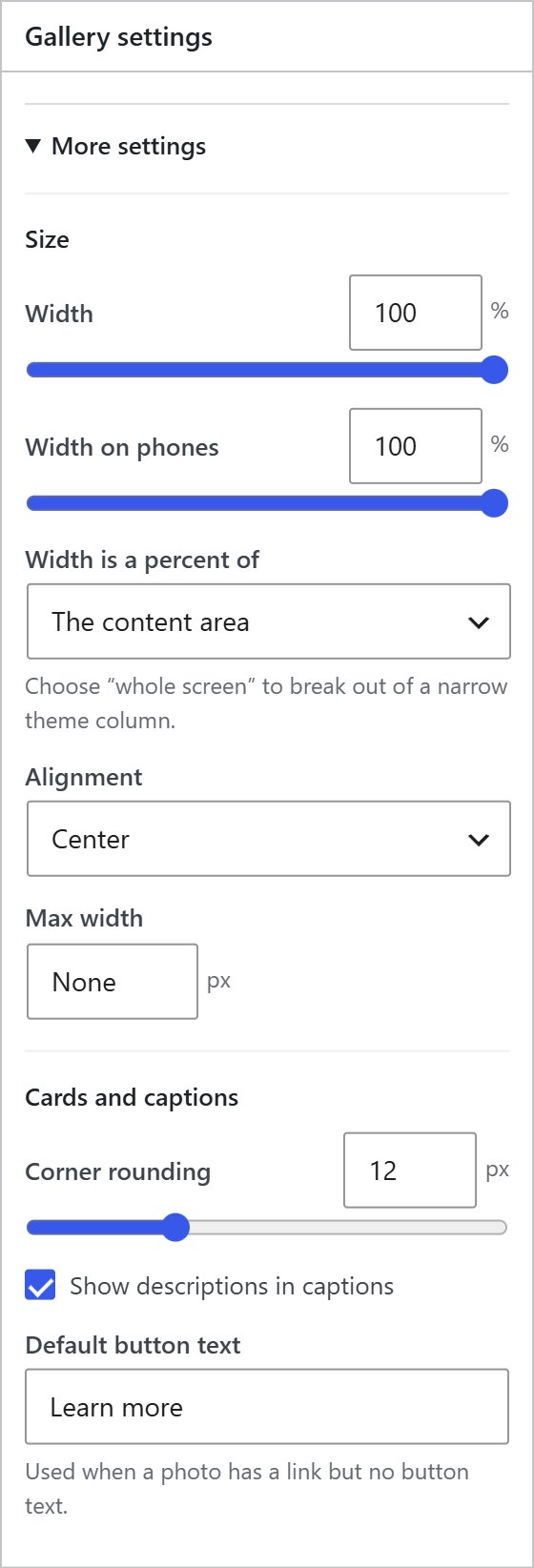
More settings: Size and Cards and captions.
Colours
Accent, Background, Button and Button text. Leave them empty and the frames stay neutral so your photos carry the colour. Text colours are picked automatically so they stay readable.
Expanding Panels
Only shown for the Expanding Panels layout.
| Setting | Options | Default |
|---|---|---|
| Open a panel on | Hover or Click. | Hover |
| Hover highlight | Outline, Lift up, Photo zoom, Spotlight or None. | Outline |
| Open panel width | How much wider the open panel gets, 2× to 10×. | 4× |
Protection
Watermarks are covered in chapter 9, and passwords and right-click protection in chapter 10.
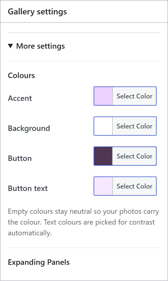
More settings: Colours. The Expanding Panels options appear under them when that layout is chosen.
Chapter 7
Add a gallery to a page.
Make the gallery once, then show it anywhere. Change the gallery later and every page that shows it updates.
In the block editor
- Edit the page, click + and search for PrismFX Gallery.
- Choose your gallery in the Gallery list in the sidebar.
- Optional: pick a Layout on this page to use a different layout here only.
Edit photos and settings takes you straight to the gallery screen.
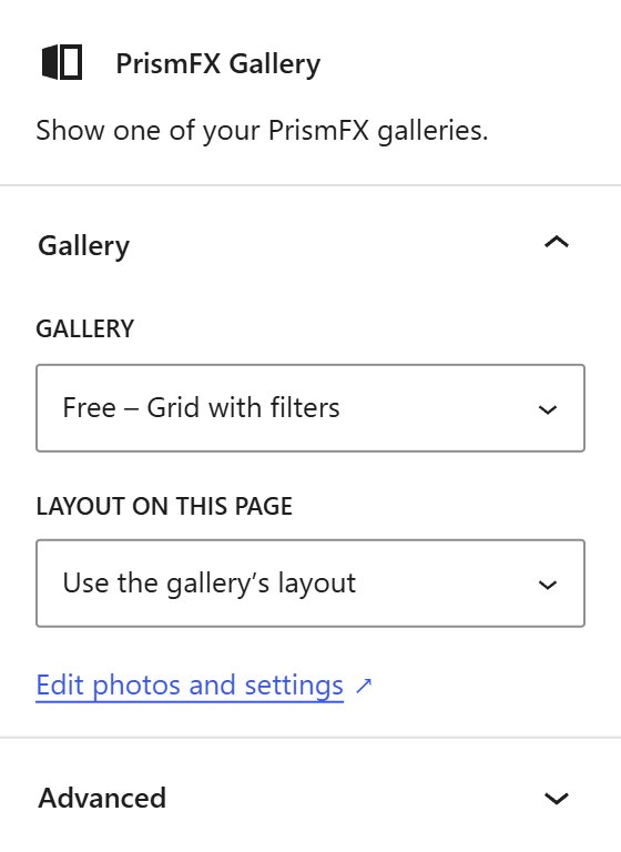
The PrismFX Gallery block settings.
With the shortcode
Every gallery has a shortcode like [prismfx id="123"]. Copy it from the Add to a page box (or the All galleries list) and paste it anywhere that accepts shortcodes:
- Cornerstone: a Text or Raw Content element.
- Elementor: the Shortcode widget.
- Divi: a Text or Code module.
- Classic editor and widgets: paste it on its own line.
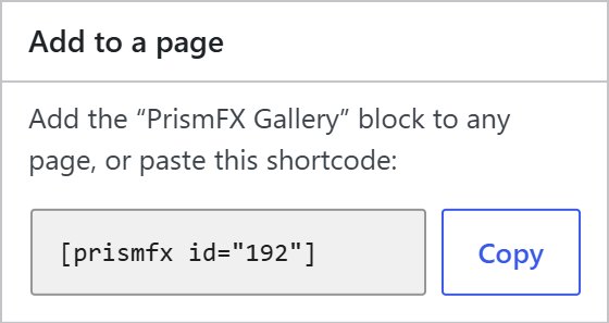
The Add to a page box. Copy puts the shortcode on your clipboard.
Shortcode options
| Option | What it does | Example |
|---|---|---|
| id | Which gallery to show. Required. | [prismfx id="123"] |
| layout | Use a different layout on this page only. Use a shortcode name from chapter 4. | [prismfx id="123" layout="coverflow"] |
| phone_layout | A different layout for phones on this page, or same. | [prismfx id="123" phone_layout="grid"] |
| class | Adds your own CSS class, for custom styling. | [prismfx id="123" class="my-gallery"] |
AlbumsPro have their own shortcode: [prismfx_album id="45"].
Preview before you publish
The Preview box at the bottom of the gallery screen shows the gallery exactly as visitors will see it. It shows the last saved version, so click Update to refresh it.
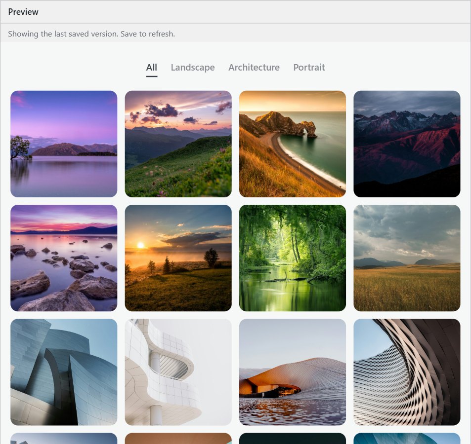
The Preview box on the gallery screen.
Chapter 8
Filters, viewer and sharing.
What your visitors can do with a gallery. Try it on the live gallery below: click a filter, then a photo.
Category filters
When photos have categories, filter buttons appear above the gallery: All plus one per category. Grids re-sort with a smooth animation. Turn the filter off with Show category filter in Look.
The full-screen viewer
- Click any photo to open it large, with its title, description and button.
- Move with the arrows, the ← → keys, or by swiping.
- Close with Esc, the close button, or by swiping down on a phone.
Share a single photo
While the viewer is open, the page address points to that photo. Copy it from the address bar and send it: the link opens the page with that photo already showing.
Moving galleries
3D and FX layouts can be dragged, swiped and controlled from the keyboard. Autoplay pauses while the pointer is over them, and there is a pause button for anyone who prefers still pictures.
Alpine First Light
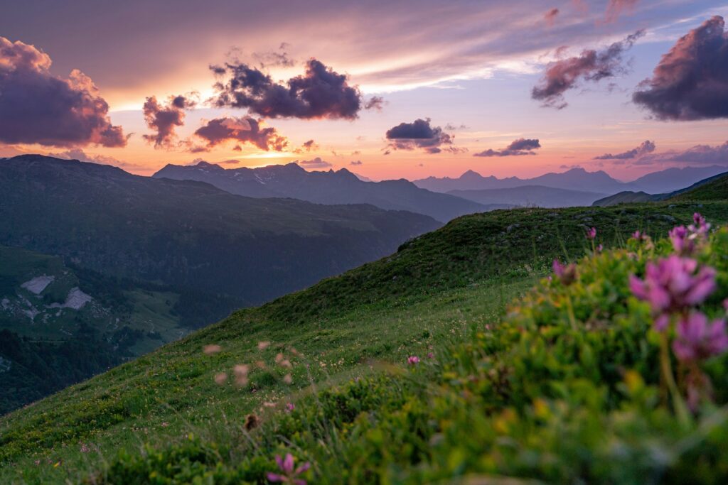
Salt Flats
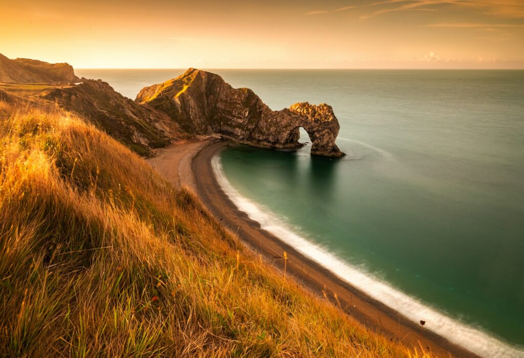
Fjord at Dusk
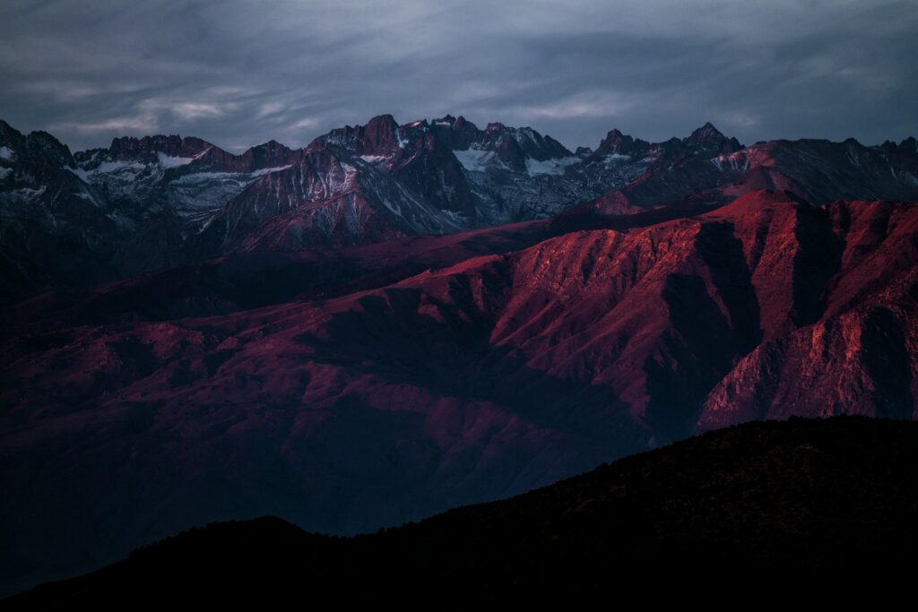
Highland Road
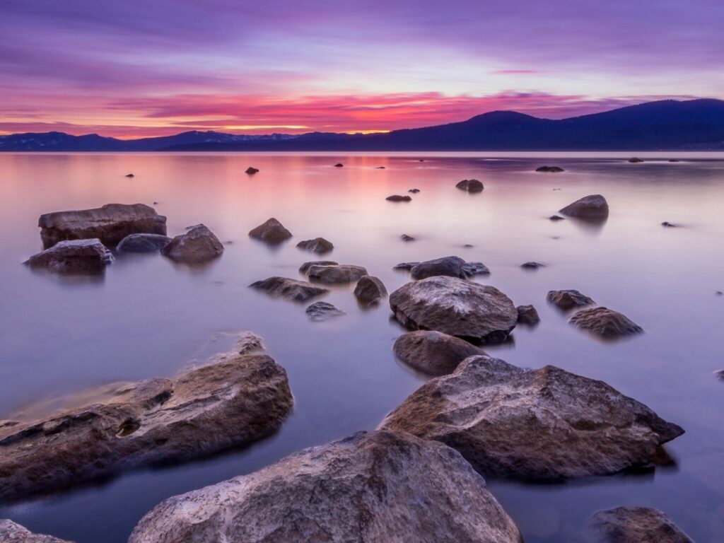
Desert Lines

Glacier Lake

Coastal Fog
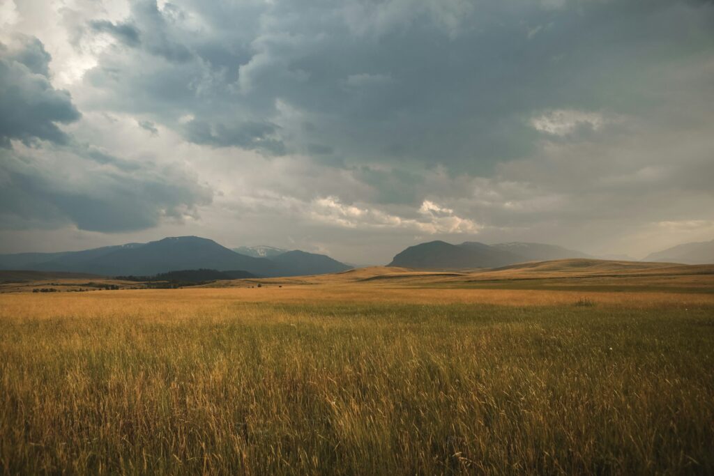
Pine Ridge
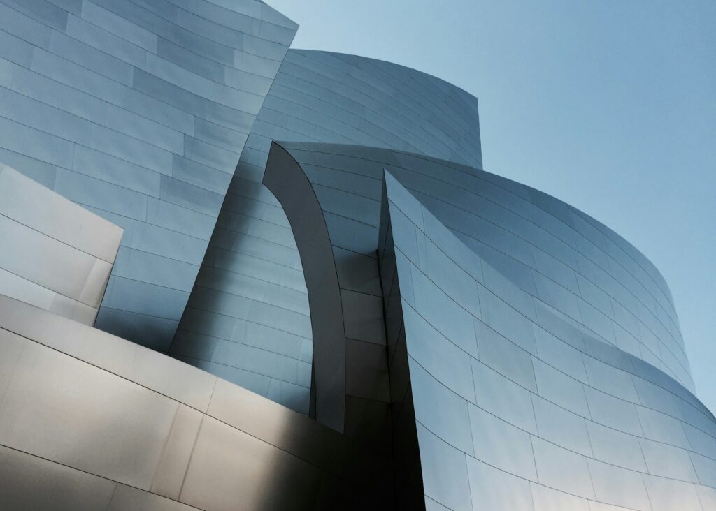
Concrete Curves

Glass Tower
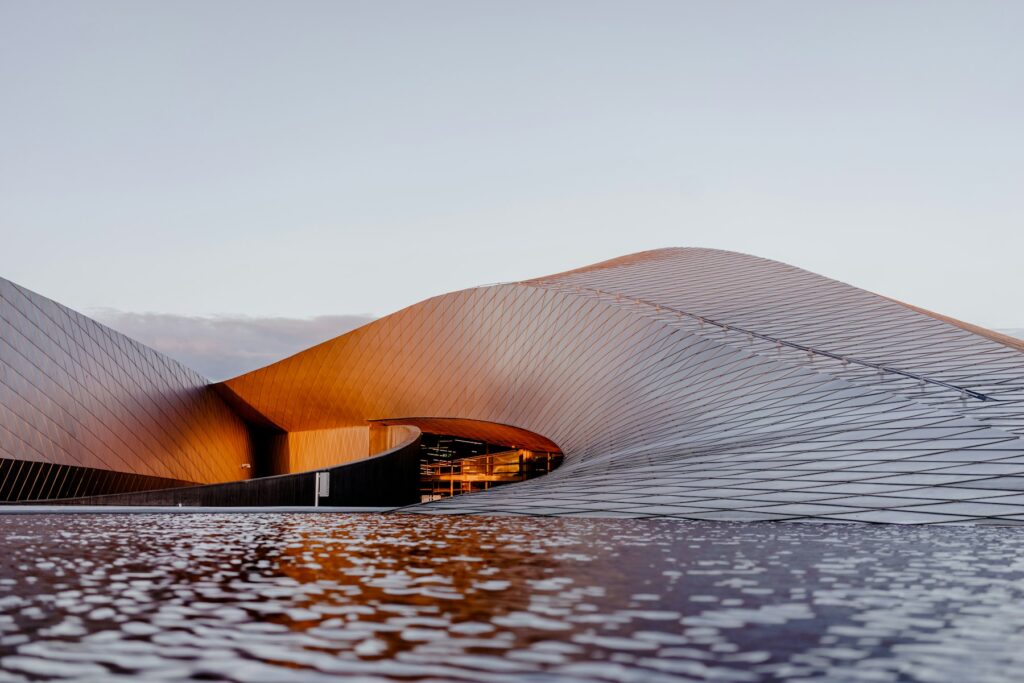
Spiral Stair

Facade Rhythm
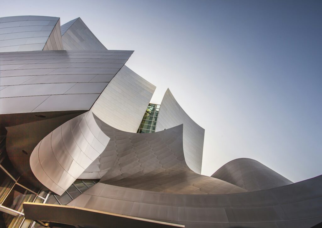
Bridge Lines

Museum Light
Arches

Skyline Grid

Quiet Light

Studio Blue

Golden Hour

Window Portrait

Soft Focus

Monochrome
Street Portrait

Natural Light
Chapter 9
Watermark your photos.
Included in the free plugin. Put your name or studio over every photo in a gallery.
- Open the gallery and click More settings.
- Under Protection, type your Watermark text, for example
© Your Studio. - Choose a Watermark position: Bottom-right corner, Centre, or Repeated across the photo.
- Click Update.
The watermark shows in the gallery and in the full-screen viewer. It is drawn over the photo on the page, so your original files in the Media Library stay untouched, and you can change or remove it at any time.
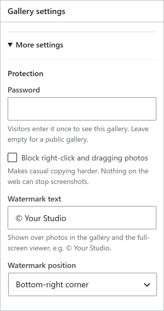
The Protection settings. Password and right-click protection appear here when Pro is active.
Chapter 10
Pro features.
Everything in this chapter needs PrismFX Pro. See What Pro gets you for live demos of each one.
AlbumsPro
An album groups several galleries behind cover photos. Visitors click a cover and that gallery opens in place.
- Go to PrismFX → Albums → New album and give it a name.
- Under Galleries in this album, tick the galleries to include and drag them into order. The first photo of each gallery is its cover.
- Choose 2, 3 or 4 Columns, then click Publish.
- Paste the album shortcode, like
[prismfx_album id="45"], into any page.
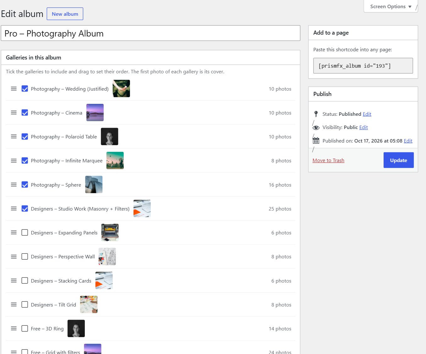
The album screen. A password-protected gallery shows a Private lock on its cover and asks for the password when opened.
VideoPro
Paste a YouTube, Vimeo or .mp4 address into a photo’s Video link box. The photo becomes the video’s cover with a play button, and the video plays in the full-screen viewer. Photos and videos can be mixed in one gallery.
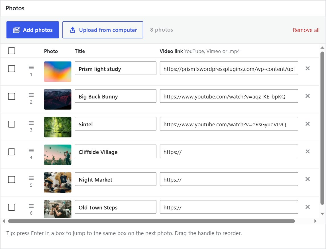
The Video link column in the Photos table (other columns hidden here).
Password-protected galleriesPro
- Open the gallery and click More settings.
- Under Protection, type a Password and click Update.
- Send your client the page link and the password.
Visitors see This gallery is private. Enter the password to view it. Once they enter it, it is remembered in that browser for 30 days. Leave the password empty to make the gallery public again.
- No photos are sent to the browser until the right password is entered.
- Pages with a private gallery are never stored by page caches, so the gallery can’t leak through a cached copy.
- A private gallery stays hidden even if Pro is switched off or your licence lapses.
Right-click protectionPro
Tick Block right-click and dragging photos under Protection. It makes casual copying harder. Nothing on the web can stop screenshots, so combine it with a watermark for client work.
Updates and your licencePro
Pro layouts and features keep working whatever the licence state. An active licence adds automatic updates. See chapter 1 to activate or move it.
Chapter 11
Import from 3D Photo Carousels.
Used the 3D Photo Carousels plugin before? PrismFX can bring your carousels across.
- Go to PrismFX → Import. The screen lists each carousel it found, with its number of photos and whether it has been imported.
- Click Import carousels.
Each carousel becomes a PrismFX gallery with the same photos, captions, buttons and settings. Your original carousels are not changed, and carousels already imported are skipped if you run it again.
After importing you can deactivate 3D Photo Carousels: pages that use the old [carousel3d] shortcode keep working and show the imported gallery.
If the screen says No carousels from 3D Photo Carousels were found on this site, there is nothing to import.
Good to know
Fast, accessible, phone-friendly.
PrismFX does this for you. Nothing to switch on.
Loads only where needed
PrismFX’s scripts and styles load only on pages that show a gallery. Everywhere else, your site is untouched.
Right-sized photos
Every photo comes in several sizes, so phones download small files. Photos further down the page load as visitors reach them.
Quiet when off screen
Moving galleries pause when they’re off screen, so several on one page stay smooth.
Keyboard and screen readers
Every photo opens from the keyboard, focus is always visible and screen readers get clear labels.
Respects reduced motion
If a visitor has reduced motion turned on in their system, animations are kept to a minimum.
Made for touch
Swipe to move, swipe down to close the viewer, and a separate phone layout when you want one.
FAQ
Troubleshooting and questions.
Keep exploring
Ready to build your first gallery?
Download the free plugin, or unlock all 30 layouts, albums, video and client protection with Pro.